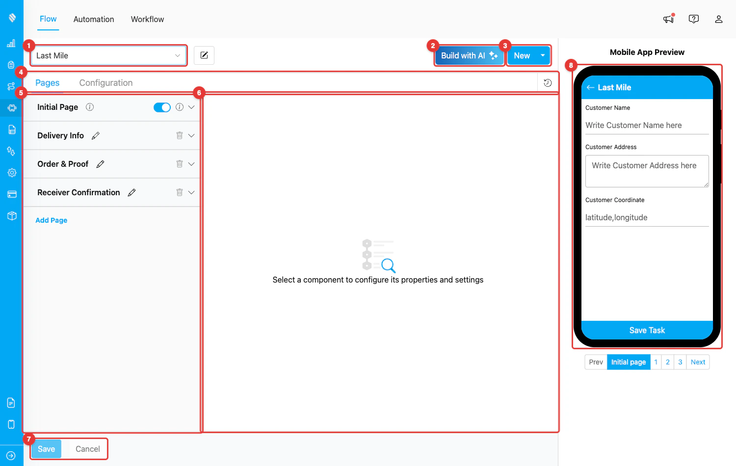
Flow Builder layout — the screen is split into an editor area (left) and a live mobile preview (right)
- Editor area (left) — where you choose the Flow, add pages, place components, and tweak settings.
- Mobile App Preview (right) — a phone-shaped simulator that renders the Flow exactly as it will look to the field worker. The preview updates automatically as you edit.
Flow Builder Layout
The numbered areas in the screenshot above correspond to the parts of the Flow Builder you will use most often:- Flow selector — Pick an existing Flow from the dropdown to edit it, or use it together with the New button to start a new one. The pencil icon next to the dropdown lets you rename the active Flow.
- Build with AI — Generate a complete Flow from a plain-language description (e.g., “Courier picks up parcels and captures proof of delivery”). Useful when you want a starting point without manually adding every page and component.
- New — Create a new Flow. The dropdown beside it gives extra options such as starting from a template.
- Pages / Configuration tabs — Switch between the Pages editor (where you build the screens) and the Configuration editor (where you map Flow data to system features like Task list and Routing). The clock icon on the right of this row opens the Version History of the Flow.
- Pages list — All pages of the Flow. The Initial Page is locked at the top, and additional Mobile App Pages are listed below it. Use Add Page to create a new page. Each page can be renamed (pencil), deleted (trash), or collapsed (chevron).
- Component editor — When you select a component from a page, its settings appear here. If nothing is selected, the empty-state message “Select a component to configure its properties and settings” is shown.
- Save / Cancel — Save persists every change you have made, while Cancel discards them and reloads the Flow from the server. These buttons become enabled only after you have made changes.
- Mobile App Preview — Live phone simulator showing how the Flow will appear on the field worker’s device, including page navigation buttons (Prev / page numbers / Next) at the bottom.
Pages
A Flow is organized into pages. Each page is one screen on the mobile app. There are two types of pages:- Initial Page — Always exists at the top of the list and cannot be deleted. This is the screen shown when a task is created (usually filled in by the admin on the web). It typically captures the customer info, address, and coordinate so the task is ready for routing.
- Mobile App Page — Additional screens shown to the field worker while completing the task. You can add as many as you need with Add Page, and reorder them by dragging.
Components
Components are the building blocks of a Flow. Each one captures or displays a specific kind of information.
Browse the Component: Input overview and each component’s page (View, Select, Photo, etc.) for detailed settings and use cases.
Configuration
The Configuration tab (next to Pages at the top) is where you map the Flow’s components to system features outside of the form itself. Setting this up correctly is what makes the Flow work properly with Tasks, Routing, and other modules. The main configurations are:- Task List — Choose which component values appear as the Title, Content, and Label of a task on the task list (both web and mobile).
- Routing — Map which components feed the route planner (Visit Name, Address, Coordinate, Open/Close Time, Visit Duration, etc.). Without this, the Flow’s tasks cannot be used in Route Optimization.
- Time — Set the default Start Time and End Time of a task created with this Flow (offsets in hours from creation time).
- Data Source — Bind components to data sources defined in MileApp’s Data Source menu so values can be pre-filled or selected from a master list.
Mobile App Preview
The right side of the Flow Builder shows a live phone simulator. Every change you make in the editor area is reflected here within seconds — no need to save and re-open the app to check the layout. The preview includes:- The phone screen with the active page rendered using mobile styles
- Page navigation controls below the phone (Prev, page numbers, Next) so you can click through each page
- Component-specific visualizations — text inputs show placeholders, photo components show a camera icon, signature components show a drawing pad outline, and so on
Version History
The clock icon next to the Pages/Configuration tabs opens the Version History of the Flow. Every save (and every key action like adding/editing/deleting pages or components) is recorded as a separate version that you can review or restore. This is useful when you want to roll back an accidental change or audit who edited what.What’s Next
- How to Use Flow — Step-by-step walkthrough of the Flow lifecycle from build to mobile usage
- Initial Page — Detailed guide on the Initial Page
- Mobile App Page — Detailed guide on Mobile App Pages
- Build Flow with AI — Generate a Flow from a description
- Previewing a Flow — Tips on using the mobile preview effectively