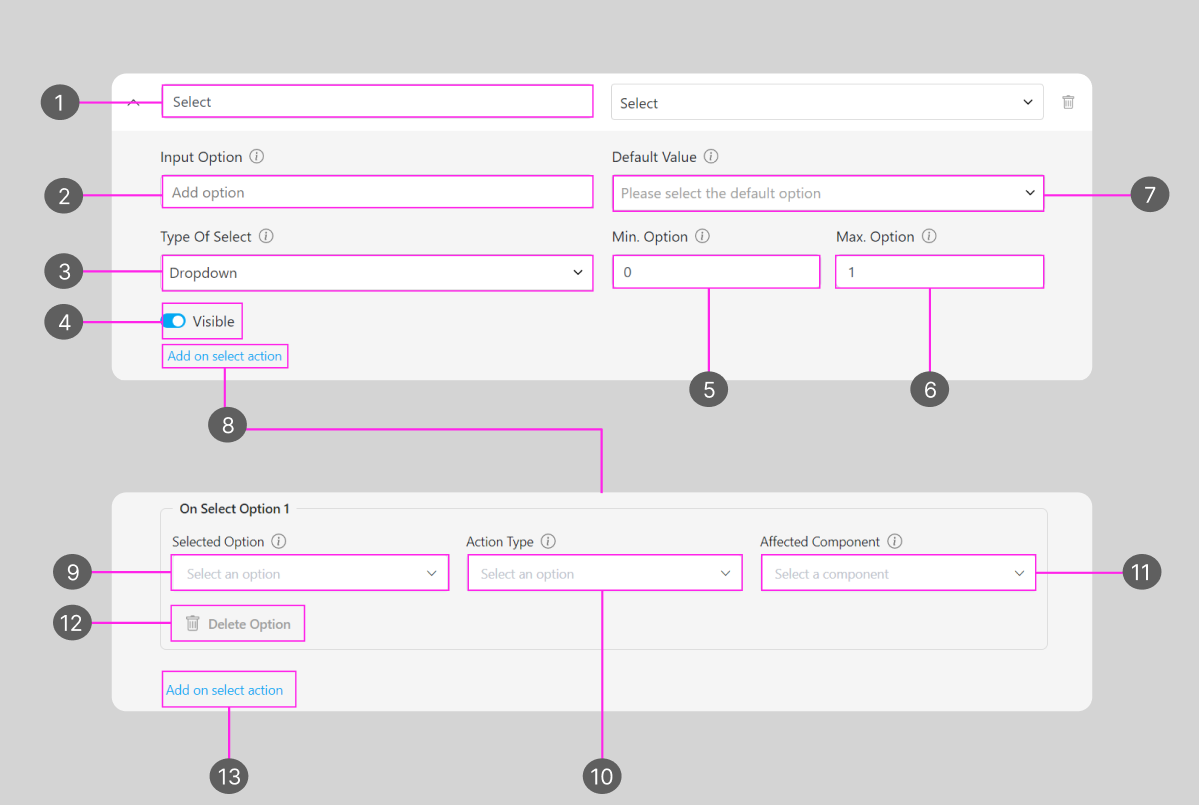
- Title of this Component
- The option that would appear for this Select component
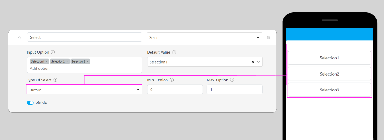
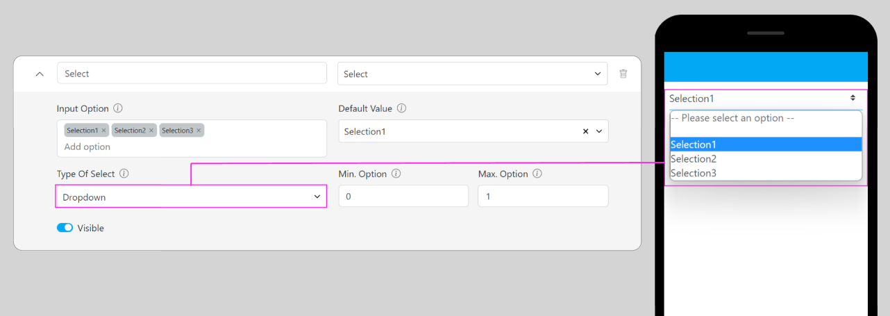
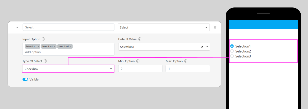
- Type of Select component
- Visibility of this component will affect: Create Task on the Web and Mobile; and View Task on the mobile app, if the component is not visible, it won’t be shown on the UI. Visible & Hidden component data will be exported, regardless of their visibility.
- Minimum selected option for select component, if it was set more than 0 when you create or work on a task, you should at least select the option based on the minimum number, or the task can’t be submitted or can’t be finished on the mobile app.
- Maximum selected option for this flow’s component, if you choose more than the maximum number when you create or work on a Task, the task can’t be submitted or can’t be finished on the mobile app.
- Default Value for this component, if you choose an option for this Value, a task that is created with this flow will have a pre-selected option based on the value that you put here. On the other hand, if you leave it blank, task that is created using this flow will not have a pre-selected option.
- Add on select action is used to add an action to the answer choices in the select component. By adding an action, each answer chosen will affect other components, such as being able to view, hide or fill.
- The Select option field is used to select an option that has been entered in the input option to be given an action. The select option is multiple, can choose several options at once in one field.
- Action type selects the type of action to be used. There are three types of action:
- Show: Action type functions to display the selected action component data without being able to edit it again.
- Hide: Action type functions to hide the selected action component so it cannot be viewed or edited.
- Fill: Action type functions to display the selected action component data and can be edited again as need
- Affected component functions select existing components as component actions that will be affected by the select action when one of the options is selected
- Delete option is used to delete on select options that have been created
- Add select option is used to add a new field on select option
Dropdown
Checkbox
Button
Button types are only available if the “Maximum Selected Option” is more than 1