- The pages your team will step through on the mobile app (Initial Page + one or more Mobile App Pages).
- The components on each page (input, select, photo, signature, list, bill, and so on) that capture the data you need.
Required permission:
- View Flow
- Create Flow
- Delivery — recipient details, photo of package, signature on delivery.
- Pickup — sender details, package count, pickup photo.
- Inspection — checklist, condition photos, technician notes.
- Canvassing / Field Sales — store visit, order capture, follow-up notes.
Opening the Flow Builder
Open the Flow section from the sidebar. The Flow Builder is the single page you use to pick an existing Flow or start a new one.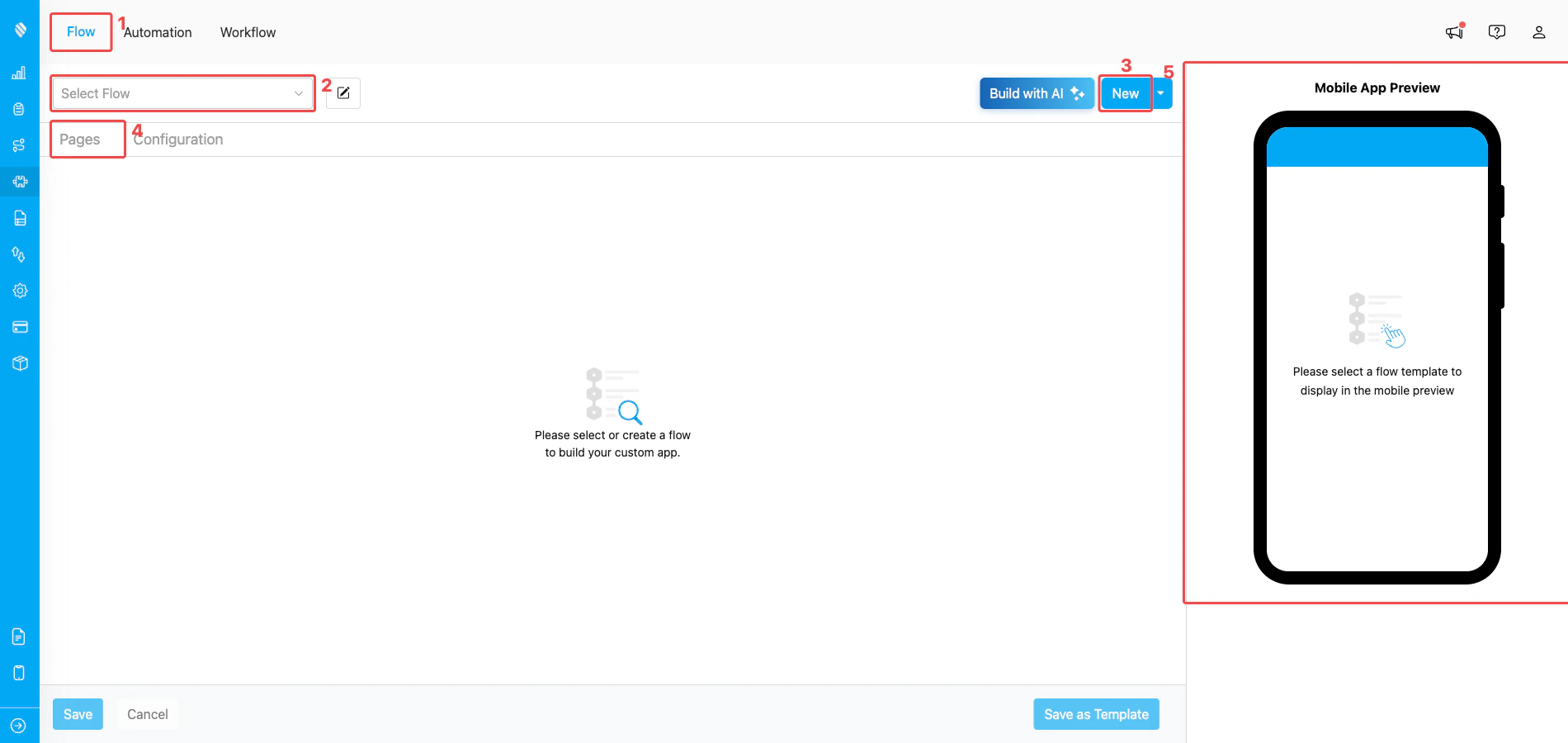
The Flow Builder when no Flow is selected yet
- Flow tab — the top sub-navigation shows three tabs (Flow / Automation / Workflow). Stay on the Flow tab to design and edit Flows.
- Select Flow — open this dropdown to pick an existing Flow in your organization. Once you pick one, its pages and configuration load into the builder.
- New — create a new Flow from scratch. A small modal asks for the Flow title, then drops you back here with the new Flow ready to edit. (Use the chevron next to New to access additional creation modes such as templates.)
- Pages / Configuration — once a Flow is loaded, these two tabs switch between the builder’s two halves: Pages (design the forms) and Configuration (set Title/Content/Label, Time, Route, etc.).
- Mobile App Preview — the right-side panel renders the Flow the way your field worker will see it on the mobile app. It updates live as you edit.
Designing the Pages
When you pick or create a Flow, the Pages tab is where you actually build the form.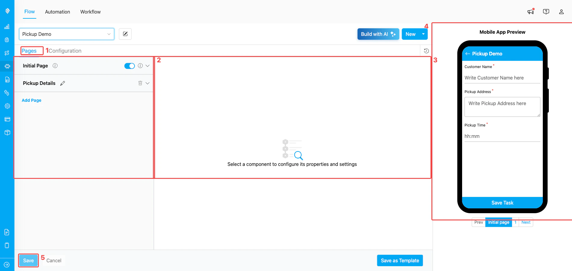
Pages tab with a Flow loaded — Initial Page plus a Mobile App Page
- Pages tab (active) — keep this tab open while you’re adding pages and components to the Flow.
- Page list — every Flow has one Initial Page at the top and zero or more Mobile App Pages underneath. Click Add Page to append more, or the trash icon to remove a non-initial page.
- Component canvas — the centre area shows the components on the page you have selected. Click any component to edit its settings; the prompt “Select a component to configure its properties and settings” appears when nothing is selected.
- Mobile App Preview — the same Flow rendered as it will appear on the mobile app, so you can sanity-check the field worker experience as you build.
- Save — commits all changes to the Flow. Cancel discards unsaved changes; Save as Template stores the current Flow as a reusable template.
Why the Initial Page matters
A task usually moves through three states:- Task Created — the admin (or another field user) creates the task on the web or mobile app.
- Task Assigned — the admin picks the field user who will do it.
- Task Done — the field user finishes the work on the mobile app.
Configuring the Flow
The Configuration tab holds the Flow-level settings that decide how each task looks in the Task list, on the mobile app, and inside Route Optimization.Task List (Title, Content, Label)
These three fields pick which Initial Page component is shown as the headline information on the task list (web + mobile).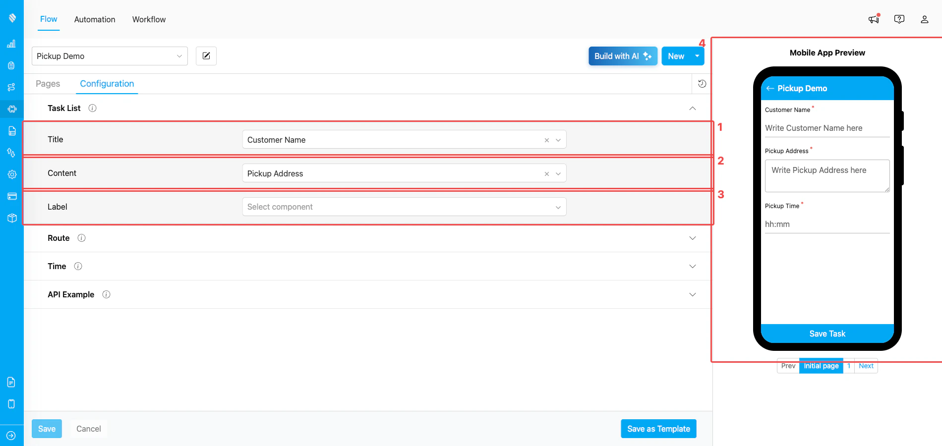
Configuration → Task List with Title, Content, and Label assigned to Initial Page components
- Title — usually the customer name or order ID. Shown as the first, bold line of every task row.
- Content — usually the address or a short description. Shown as the secondary line under the title.
- Label — usually a phone number, label code, or other small piece of identifying info. Shown as a small pill below the content.
- Mobile App Preview — the preview on the right immediately reflects the chosen Title/Content/Label so you can confirm they read well.
input and select components are eligible). Pick the components whose values best identify the task at a glance.
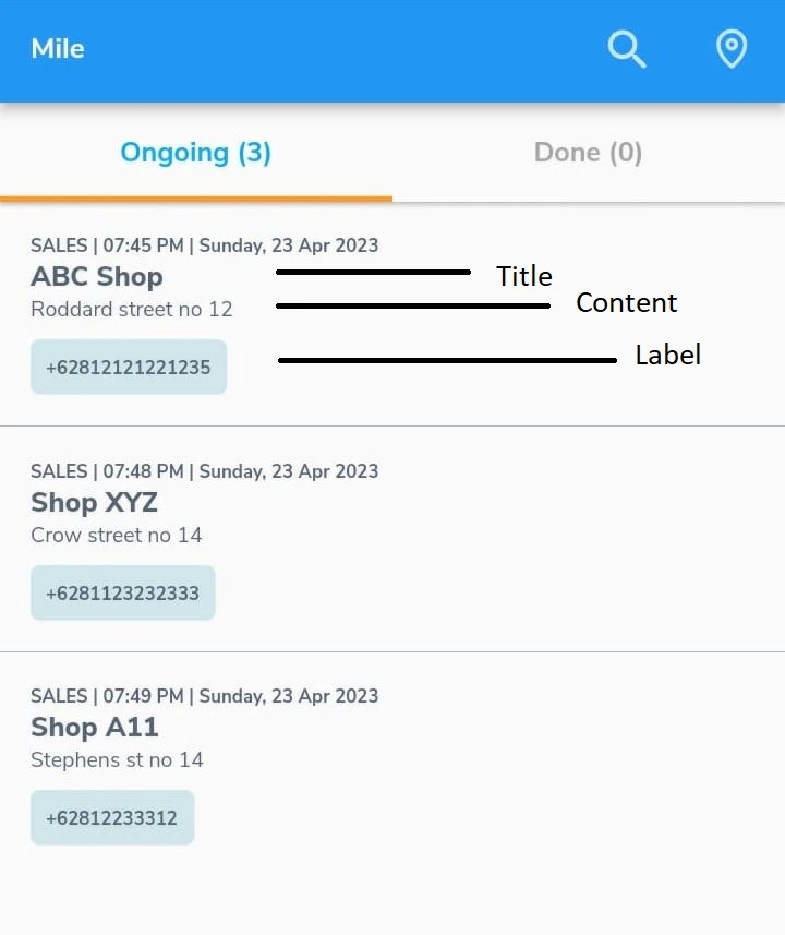
How the Title, Content, and Label appear on the mobile app task list
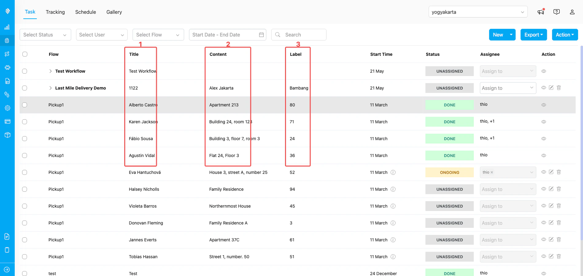
How the Title, Content, and Label render as columns in the web Task list
- Title column — shows the value of the component mapped to Title (here, the customer name on each task row, e.g., Alberto Castro, Karen Jackson).
- Content column — shows the value of the component mapped to Content (here, the pickup address, e.g., Apartment 213, Building 24, room 123).
- Label column — shows the value of the component mapped to Label (here, a numeric package label, e.g., 80, 71, 24).
Time (Start Time & End Time)
Time settings control when a task is visible to the assigned field user by default — both values are measured in hours from a reference point.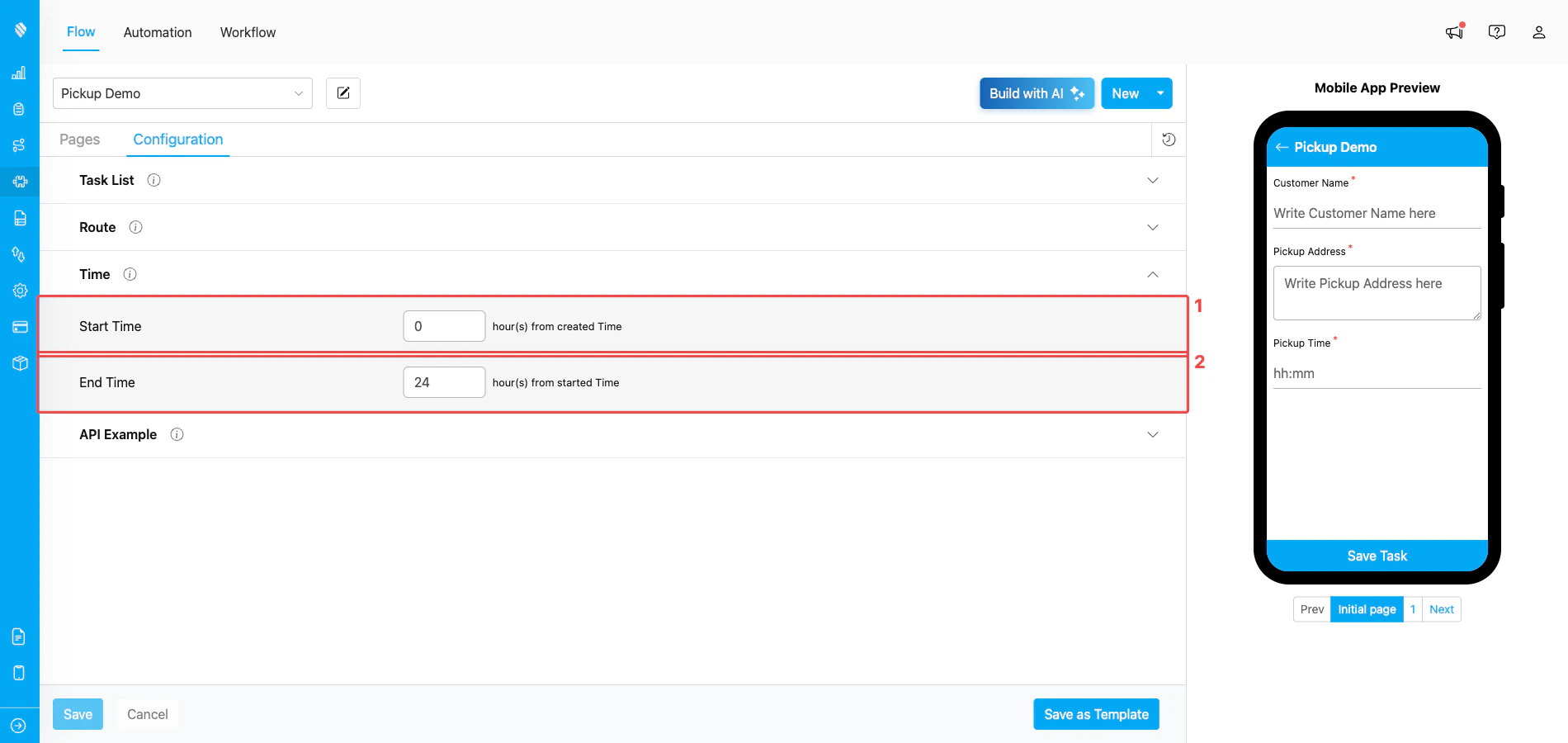
Configuration → Time with default Start Time and End Time
- Start Time — hours from when the task is created. With 0, the task is visible to the assignee right after creation. Set a positive number to delay visibility (e.g., 8 to only show the task at the start of the workday).
- End Time — hours from the start time. With 24, the task expires one day after it starts. Lower the number to set a tighter deadline.
The values you set here are defaults applied when each task is created. The user creating a task can still override the start and end time for that specific task before submitting.
What’s Next
- Building Flow — full walkthrough of creating a Flow from scratch or from a template.
- Flow Builder → Introduction — reference for every part of the Flow Builder UI.
- Page: Initial Page and Page: Mobile App Page — how each page type behaves.
- Creating a Task — use your saved Flow to create the first task.